Finding signal on Twitter is more difficult than it used to be. We curate the best tweets on topics like AI, startups, and product development every weekday so you can focus on what matters.
Clean, geometric letterforms with minimal stroke contrast give it a contemporary, tech‑friendly feel.
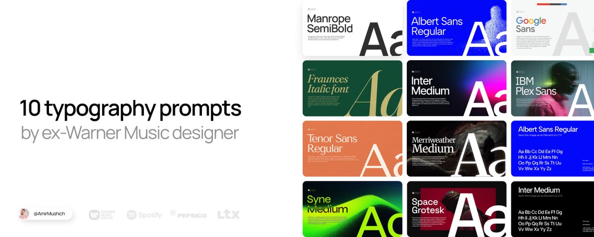
PROMPT:
Generate with my customized template 🔽
https://amirmushich.link/ai-fonts
How to use this template 👆
Download my Elements (as images) from this project
Upload them into your LTX Project as Your Elements
Copy my prompts from the LTX Project
Paste the prompt into your project → tag the uploaded Element with @[ELEMENT NAME]
Generate consistent typography → repeat with all the prompts 👇
2. FRAUNCES
Premium, “Old money” style
For: Branding and logos that want a classic serif voice with a warm, offbeat personality (e.g., heritage, food, or friendly fintech/“saucy” business vibes).
Why: Headlines, hero sections, and editorial layouts where expressive typography does the storytelling.
PROMPT:
Generate with my customized template 🔽
https://amirmushich.link/ai-fonts
3. SYNE
Artsier, experimental geometric sans
Fits for:
Cultural institutions, creative studios, posters, and edgy editorial layouts.
Why:
Condensed, graphic shapes and bold weights create a strong, contemporary “art center” voice at display sizes.
PROMPT:
Generate with my customized template 🔽
https://amirmushich.link/ai-fonts
4. INTER
System, product and UI workhorse
Fits for:
Apps, dashboards, documentation, and any digital product needing maximum clarity.
Why:
Neutral, highly readable at small sizes with a huge weight range and excellent language/feature support.
PROMPT:
Generate with my customized template 🔽
https://amirmushich.link/ai-fonts
5. ALBERT SANS
Friendly, modern grotesque sans
Fits for:
Startups, lifestyle brands, landing pages, and simple marketing sites.
Why:
Soft, approachable shapes make it feel less corporate than strict neo‑grotesques while staying versatile.
PROMPT:
Generate with my customized template 🔽
https://amirmushich.link/ai-fonts
6. MERRIWEATHER
Screen‑optimized classic serif
Fits for:
Blogs, news sites, long‑form reading, and editorial platforms.
Why:
Large x‑height and sturdy forms keep paragraphs comfortable and readable, especially on digital displays.
PROMPT:
Generate with my customized template 🔽
https://amirmushich.link/ai-fonts
7. TENOR SANS
Refined, editorial sans
Fits for:
Magazines, minimalist brands, and content‑heavy layouts with a sophisticated tone.
Why:
Narrow proportions and subtle personality work well for headlines and shorter text with an editorial feel.
PROMPT:
Generate with my customized template 🔽
https://amirmushich.link/ai-fonts
8. SPACE GROTESK
Techy, retro‑futuristic sans
Fits for:
Developer tools, Web3/crypto, tech startups, and data‑driven interfaces.
Why:
Inherits “code” DNA from Space Mono, giving a distinctive digital character that pops in headlines and UI.
PROMPT:
Generate with my customized template 🔽
https://amirmushich.link/ai-fonts
9. GOOGLE SANS
Branded, geometric‑humanist Google look
Fits for:
Product and marketing sites that want a clean, “big tech” aesthetic.
Why:
Rounded, geometric forms feel friendly and modern, great for bold headings and hero copy.
PROMPT:
Generate with my customized template 🔽
https://amirmushich.link/ai-fonts
10. IBM PLEX SANS
Corporate, engineered humanist sans
Fits for:
Enterprise products, design systems, documentation, and tech brands.
Why:
Built for IBM’s ecosystem, it balances technical precision with human warmth and scales well from UI to brand.
PROMPT:
Generate with my customized template 🔽
https://amirmushich.link/ai-fonts
THE MAGIC OF DETAILS
The settings I calculated for you aren’t random numbers - they’re your key for premium typography.
Here’s how it works:
Tracking / Kerning - Negative values (-3% to -7%) in headlines create tight, luxurious spacing.
Leading - 0.8–0.9 for headlines adds blocky and solid sense, making the headline a strong design element.
Google Fonts choice - All free, web-safe, high-quality fonts I’ve battle-tested in real campaigns for years.
Colors & alignment - not mandatory choices, but catchy, high contrast and hooky for many cases.
PRO TIP:
Custom colors - made easy:
In my prompts I use HEX codes (#000000, #FFFFFF etc.) so you can copy-paste exactly.
But inside LTX prompt window there’s a better way:
Built-in Color Picker
Click the color field → opens visual selector
Use eyedropper tool → pick any color directly from your browser/screen
No need to hunt HEX codes - just point & click
Repeat these 2 steps:
DESIGN & FINE TUNE YOUR CONTENT:
It’s time to design your content & make final polish steps to make it look great.
Let’s do it 👇
Overlay your text on an image:
follow these simple steps + copy the prompt below
PROMPT:
Upscale your images for better quality:
This is it:
Your premium content is ready to go live!
BONUS 🎁
Free bonus: massive pack of asstes for $0
Free font pairings - curated by me
Royalty free music track - with license for commercial use
Pack of video transitions
Pack of prompts for video creators
Media kit template - to help you land clients
Get your pack here:
https://amirmushich.link/freebies
This is the exact typography workflows I use myself.