Finding signal on Twitter is more difficult than it used to be. We curate the best tweets on topics like AI, startups, and product development every weekday so you can focus on what matters.
Originally published by @mattyp on X. Tech Twitter preserves the original source alongside this readable edition.
Before you dive in
• Explore San Francisco transit efficiency through isochrones
• Discover how neighborhood location, driving, cycling, and public transit compare for 30-minute...
Best for builders who want practical takeaways. 6 min read.
I've moved a lot - 6 times in the last 7 years.
This comes with some fun optimization problems: commute, access to amenities, etc
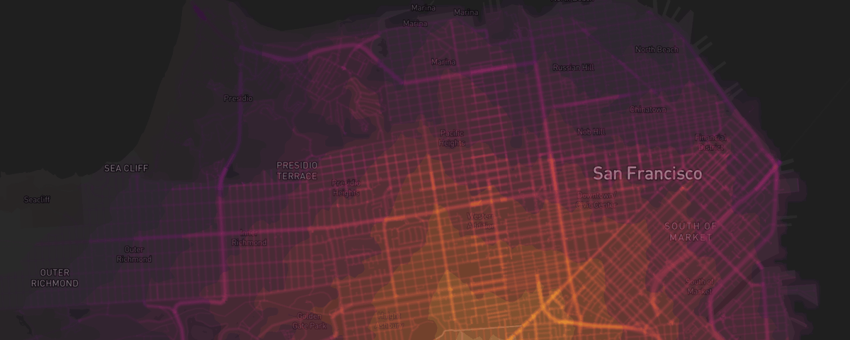
Because I overanalyze things, I like using isochrones as a visual way to understand travel times for a given location.
An isochrone is a map that holds time constant - i.e an area by which I can travel in 30 minutes.
For example, the above shows the furthest distance I can walk / bike / ride in 30m from a neighborhood (deep purple) with concentric polygons for shorter times (3m at center)
I already live in San Francisco, but what can we learn about getting around the city from isochrones? Inspired by @towheretobegin's post about New York, let's take a look
You can find the deployment & code at the bottom of this article.
By neighborhood & modality
This video iterates through district (alphabetical) and modality (walking, cycling, driving, & transit) for 30m max distances.
One fun part about the app - I used in-browser video rendering for all the videos you see - I generated the analysis directly from the app.
Several things are apparent:
Every 30m bound is geographically limited - there is no neighborhood with access to the entire city by ANY modality in <30m
Driving and cycling appear the most effective modalities
Neighborhoods near highways are more important for access to areas outside the city - marin, oakland, south bay, etc. This makes sense, because there is no highway in the city
Modality comparison
Next, I wanted a direct modality comparison. For each neighborhood, what's the best way to get around?
These isochrones hold neighborhood and travel time fixed with colored overlays for modality
Pretty consistently driving > cycling > public transportation.
This is confirmed by looking at the average isochrome area by modality.
We doomscroll, you upskill
Get the 10 tweets shaping how builders think today.
Newsletter
We doomscroll, you upskill
Get the 10 tweets shaping how builders think today.
Interestingly, there's an inflection point around 20 minutes. On average you can get further in 20 minutes via bike than car!
Walking is obviously the slowest, but it's also fun and leads to good ideas :)
You're locked in
Next, I asked the question “is there any part of the city that allows you to access more of the city?”
Not really.
These visuals show four districts compared by modality. First, we look at Outer Richmond, Twin Peaks, Potrero Hill, & North Beach
Next, we look at Outer Sunset, Noe Valley, SoMA, & Maria
In every case, living in a corner of the city only gives you true access to THAT corner.
It takes >45m to get across the city by any modality. That means a cross-town trek (going from SOMA to the Presidio) is going to be a 2h+ round trip.
Your circle will be in your neighborhood - you're setting yourself up for a bad time if you... decide to live in Potrero Hill and date someone in the Presidio.
This means you should optimize for walking (or biking) everywhere and try to find things you care about in your quadrant.
Central neighborhoods will be optimal if you're in the city all the time - Presidio Heights, Pac Heights, & Western Addition (is this a real neighborhood?) all provide central access and the ability to get nearly everywhere that matters in the city in <30m
Cars > bikes > transit
To validate my earlier observation, we can look at the delta between different modalities by neighborhood.
The chart below looks at the cycling vs transit delta by neighborhood. Sorry MUNI superfans.
Public transit is bad in sf. In many cases, transit is equivalent to walking.
With 30 minutes of travel time, there are only TWO neighborhoods where transit is better than cycling.
At 60 minutes this looks more like 50 / 50 - but transit is almost NEVER better than taking a car.
This is a sad reality in San Francisco, a city that seems to care more about dysfunctional social service programs than infrastructure.
This doesn't tell the whole story
For all my isochrone data, the most important factors for getting around sf are really:
Neighborhood and geographic region
Distance to highways (if you need to leave the city)
Distance to MUNI / bus stops
Proximity to Bay Wheels docks
Parking
I chose to live next to a highway and lucked out living next to a Bay Wheels dock before I even knew what it was.
That means I can get to Fort Funston from my house in <20m and my gyms in Mission Rock & SOMA < 10m without worrying about parking.
Even if driving to Golden Gate Park takes ~20m, I'd rather ride a Lyft bike (30m) and enjoy the weather + not worry about parking.
Limitations & improvements
This is just a starting point. I would treat data as directionally correct, with the caveat that there are many exceptions and edge cases.
Here are some limitations and improvements:
For each neighborhood, I used an isochrone from the geographic center. A better analysis would sample travel times throughout the neighborhood via GeoJSON
I pulled neighborhoods from some government website, but I've never heard of Western Addition and I'm pretty sure some neighborhoods are missing from the map
We relied on @geoapify's approximations for traffic, but the difference between a 15m drive and a 45m drive can be little more than the time of day. A gut check on the map seems like there's room for improvement in traffic estimates
The APIs for isochrones seem limited - @geoapify's was the best I found, but @Mapbox and @TravelTimeAPI have alternatives that should be evaluated as well. The best approach is likely computing data directly from the @googlemaps API, but that's much more work
This map does not factor ebikes / lyft bikes. I can get much further in 15m than shown because I live next to a @baywheels station and use @lyft e-bikes
While the city is quite drivable, parking varies wildly - for example, I always feel comfortable driving to Dogpatch, but if I'm going to certain parts of the Sunset or North Beach, I need to add 10-15m to look for parking (and a few $).
A more robust analysis factors in parking times and compares ride share vs. driving yourself. There's probably an even deeper analysis that recommends specific neighborhoods for car ownership
There are probably more improvements to be made as well :)
Full app + deployment
My goal was to show the power of AI-native coding for data analysis. This project started from an idea and not a single line of code was written.
I hope this inspires someone to go a step further and create an even better analysis (or their next project) with AI-native tools
Deployed version:
Note: you can access isochrones for ANY point in the deployed version by disabling the 'district boundaries' - we'll see how long my API credits last :)