AmirMušić@AmirMushichFeb 25
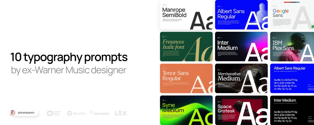
📝 10 AI presets to make your brand look elite (prompts + assets)
INTRO
Bad font design ruin any brand in 0.3 seconds. Thats what I learned (and 1,000,000s of brand owners, too).
Wrong type selection + default settings = your brand looks like trash
*This article is sponsored by LTX Studio. Thanks to the LTX team for supporting this post and my work for you.
I spent 10+ years crafting design & typography for big & small clients:from mastodons like Warner Music, PepsiCo, Spotify to a local coffeeshops.
Fonts are magical items:
they can elevate a simple brand design to a word-class level
and they can ruin even a pro-tier work if they look like sh*t.
Now I’m giving you the exact same premium look the top brands use:
without Figma, Photoshop, or years of practice.
3 TOOLS YOU NEED:
Google Nano Banana - for visual generation,
LTX Elements - for font consisttency & workflow organization,
10 prompts below - to make your brand look good.
Change only [YOUR TEXT] → get pro-level type instantly.
Save this article. Use it forever.
WORKFLOW (how it works)
How this works in 4 steps:
Access Google Nano Banana model
(I use LTX -> GenSpace for convenience & organzation)
Select or upload your font as Element for consistency
(Grab my pre-made JPEG files saved in Elements - all the links below)
Copy my preset-prompts → replace only [INSERT YOUR TEXT]
Generate → enjoy your consistent font designs
Why LTX Elements make all the difference
I tested the same prompts on a “clean” Nano Banana model without Elements:
❌ Consistency drops dramatically
Model almost always draws Bold instead of Semibold
Kerning is ignored or inaccurate
Frequent hallucinations (extra/missing text pieces)
With Elements, adherence jumps +80–90%
And the workflow is simple: upload font as Element → tag it in prompt.
This is why all 10 templates are built around this feature.
It’s the difference between genAI and advanced AI typography.
10 TYPOGRAPHIC PROMPTS
(copy & paste)
Repeat this format 10 times – each one short & scannable
How to use these prompts:
1. Copy paste it to Nano Banana
2. Replace the "INSERT YOUR TEXT HERE" with your text
3. Change colors (type it in or use Color Picker [Alt + P] in LTX)
4. Hit "Generate" and enjoy the results
1. MANROPE
Clarity & confidence
This is the font I use for in my social media designs.
I use Manrope SemiBold for headlines and Manrope Regular for body text to achieve a proper visual hierarchy.
Good fit for:
Digital products and interfaces, branding for tech, SaaS, and contemporary lifestyle companies.
Why:
Strong on‑screen legibility; clean, confident tone.
Clean, geometric letterforms with minimal stroke contrast give it a contemporary, tech‑friendly feel.
PROMPT:
Generate with my customized template 🔽
https://amirmushich.link/ai-fonts
How to use this template 👆
Download my Elements (as images) from this project
Upload them into your LTX Project as Your Elements
Copy my prompts from the LTX Project
Paste the prompt into your project → tag the uploaded Element with @[ELEMENT NAME]
Generate consistent typography → repeat with all the prompts 👇
2. FRAUNCES
Premium, "Old money" style
For: Branding and logos that want a classic serif voice with a warm, offbeat personality (e.g., heritage, food, or friendly fintech/“saucy” business vibes).
Why: Headlines, hero sections, and editorial layouts where expressive typography does the storytelling.
PROMPT:
Generate with my customized template 🔽
https://amirmushich.link/ai-fonts
3. SYNE
Artsier, experimental geometric sans
Fits for:
Cultural institutions, creative studios, posters, and edgy editorial layouts.
Why:
Condensed, graphic shapes and bold weights create a strong, contemporary “art center” voice at display sizes.
PROMPT:
Generate with my customized template 🔽
https://amirmushich.link/ai-fonts
4. INTER
System, product and UI workhorse
Fits for:
Apps, dashboards, documentation, and any digital product needing maximum clarity.
Why:
Neutral, highly readable at small sizes with a huge weight range and excellent language/feature support.
PROMPT:
Generate with my customized template 🔽
https://amirmushich.link/ai-fonts
5. ALBERT SANS
Friendly, modern grotesque sans
Fits for:
Startups, lifestyle brands, landing pages, and simple marketing sites.
Why:
Soft, approachable shapes make it feel less corporate than strict neo‑grotesques while staying versatile.
PROMPT:
Generate with my customized template 🔽
https://amirmushich.link/ai-fonts
6. MERRIWEATHER
Screen‑optimized classic serif
Fits for:
Blogs, news sites, long‑form reading, and editorial platforms.
Why:
Large x‑height and sturdy forms keep paragraphs comfortable and readable, especially on digital displays.
PROMPT:
Generate with my customized template 🔽
https://amirmushich.link/ai-fonts
7. TENOR SANS
Refined, editorial sans
Fits for:
Magazines, minimalist brands, and content‑heavy layouts with a sophisticated tone.
Why:
Narrow proportions and subtle personality work well for headlines and shorter text with an editorial feel.
PROMPT:
Generate with my customized template 🔽
https://amirmushich.link/ai-fonts
8. SPACE GROTESK
Techy, retro‑futuristic sans
Fits for:
Developer tools, Web3/crypto, tech startups, and data‑driven interfaces.
Why:
Inherits “code” DNA from Space Mono, giving a distinctive digital character that pops in headlines and UI.
PROMPT:
Generate with my customized template 🔽
https://amirmushich.link/ai-fonts
9. GOOGLE SANS
Branded, geometric‑humanist Google look
Fits for:
Product and marketing sites that want a clean, “big tech” aesthetic.
Why:
Rounded, geometric forms feel friendly and modern, great for bold headings and hero copy.
PROMPT:
Generate with my customized template 🔽
https://amirmushich.link/ai-fonts
10. IBM PLEX SANS
Corporate, engineered humanist sans
Fits for:
Enterprise products, design systems, documentation, and tech brands.
Why:
Built for IBM’s ecosystem, it balances technical precision with human warmth and scales well from UI to brand.
PROMPT:
Generate with my customized template 🔽
https://amirmushich.link/ai-fonts
THE MAGIC OF DETAILS
The settings I calculated for you aren’t random numbers - they’re your key for premium typography.
Here’s how it works:
Tracking / Kerning - Negative values (-3% to -7%) in headlines create tight, luxurious spacing.
Leading - 0.8–0.9 for headlines adds blocky and solid sense, making the headline a strong design element.
Google Fonts choice - All free, web-safe, high-quality fonts I’ve battle-tested in real campaigns for years.
Colors & alignment - not mandatory choices, but catchy, high contrast and hooky for many cases.
PRO TIP:
Custom colors - made easy:
In my prompts I use HEX codes (#000000, #FFFFFF etc.) so you can copy-paste exactly.
But inside LTX prompt window there’s a better way:
Built-in Color Picker
• Click the color field → opens visual selector
• Use eyedropper tool → pick any color directly from your browser/screen
• No need to hunt HEX codes - just point & click
Repeat these 2 steps:
DESIGN & FINE TUNE YOUR CONTENT:
It’s time to design your content & make final polish steps to make it look great.
Let’s do it 👇
Overlay your text on an image:
follow these simple steps + copy the prompt below
PROMPT:
Upscale your images for better quality:
This is it:
Your premium content is ready to go live!
BONUS 🎁
Free bonus: massive pack of asstes for $0
Free font pairings - curated by me
Royalty free music track - with license for commercial use
Pack of video transitions
Pack of prompts for video creators
Media kit template - to help you land clients
Get your pack here:
https://amirmushich.link/freebies
This is the exact typography workflows I use myself.
Now it’s yours - no gatekeeping.
Save this article as your font cheat-sheet.
Follow @AmirMushich for more articles & workflows
Next article: Building brand guidelines with AI
Turn on notifications on my profile 🔔
http://x.com/i/article/2022408755028140032