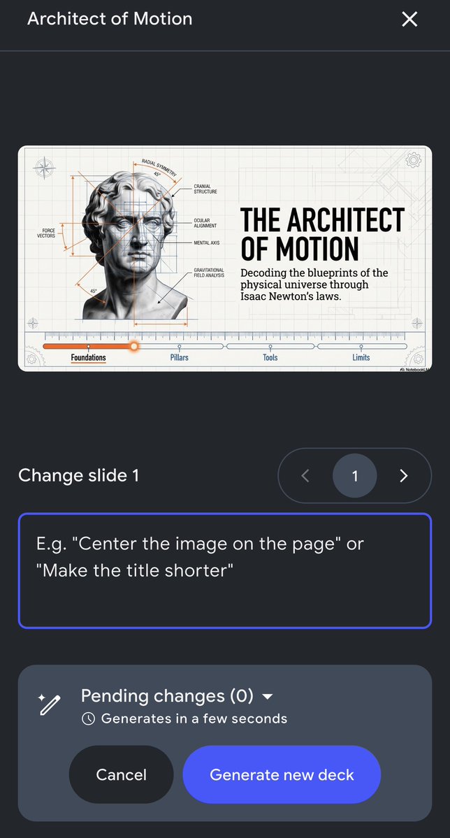
Slide Revisions are officially 100% rolled out on the mobile app! Because the best ideas (and the most urgent edits) tend to happen when you're nowhere near your computer.
Nano Banana smart prompt: Typographic ad / poster design Works with: - automotive - sport - beverage and other products Prompt 👇

Niji V7 is now live. This model features improved anime coherence, prompt understanding, text rendering, and sref performance. Enjoy!
Product management is the art of the writing the least amount of code for the greatest benefit to your users.
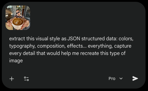
how to steal the style of any image you find online: - copy+paste your image inside Gemini 3.1 (it has vision) - step 2 : use this prompt : "extract this visual style as JSON structured data: colors, typography, composition, effects..." - step 3 : save this context file and inject it whenever you want to recreate this style
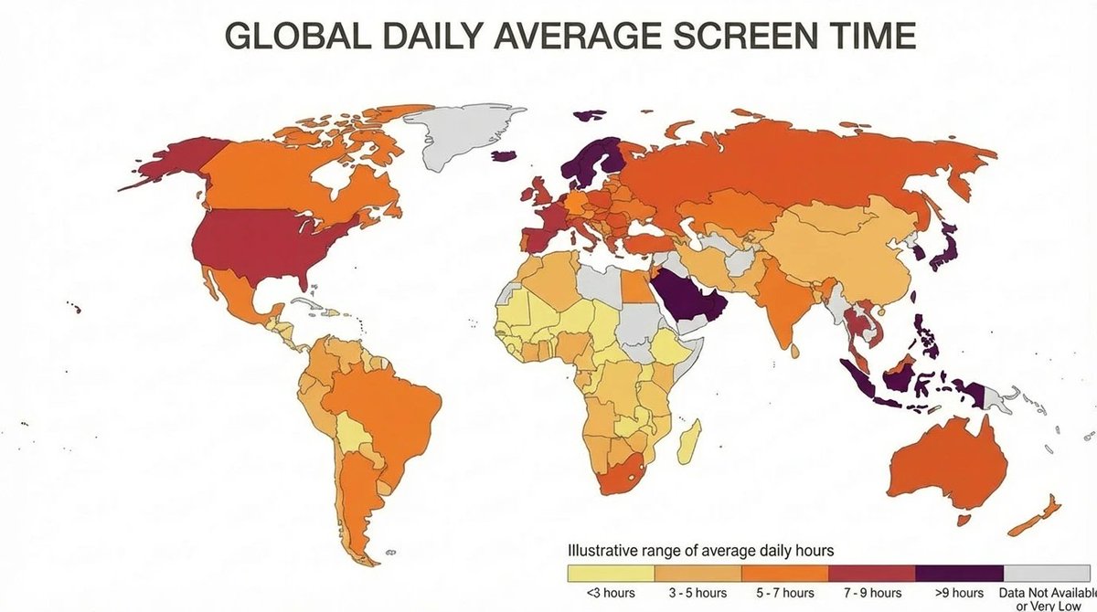
Nano Banana 2 makes amazing infographics - but IMO, there's a much cooler feature I haven't seen anyone try You can ask it to research Web data and then display it in a very specific format (not a general graphic) Ex. a heatmap of the world by global daily screen time 👇
Most companies think being "AI agent-first" means building an MCP server. But the MCP should come last, not first. Here are 5 steps worth thinking about: 1. Don't force people to use your website/app. AI agents will interact with many products first. If your product only works when a human visits your site, you're already behind. 2. Every capability needs a corresponding API. You'd be surprised how many products have beautiful UIs sitting on top of incomplete or undocumented APIs. 3. Build single-purpose, composable endpoints. Agents want to chain atomic APIs together to achieve outcomes. They don't want a monolithic endpoint that does five things. 4. Make your content agent-readable. Your docs and help centers will be consumed by agents more than humans. Clean markdown and consistent headers are a must. 5. Build an MCP server. Note how this step comes last. An MCP on top of broken APIs or poor docs is useless. Get the foundation right first. 📌 More on how to build your products for AI agents first here: https://creatoreconomy.so/p/why-you-need…

taste is a new core skill
tech bro obsessed with "storytelling" but hasn't read a book in the last 5 years

BREAKING: Within the past 72 hours: - Apple's AI Chief steps down - Apple's Head of UI Design leaves to Meta - Apple's Policy Chief steps down - Apple's Head of General Counsel steps down
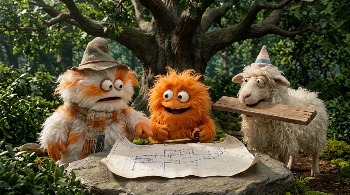
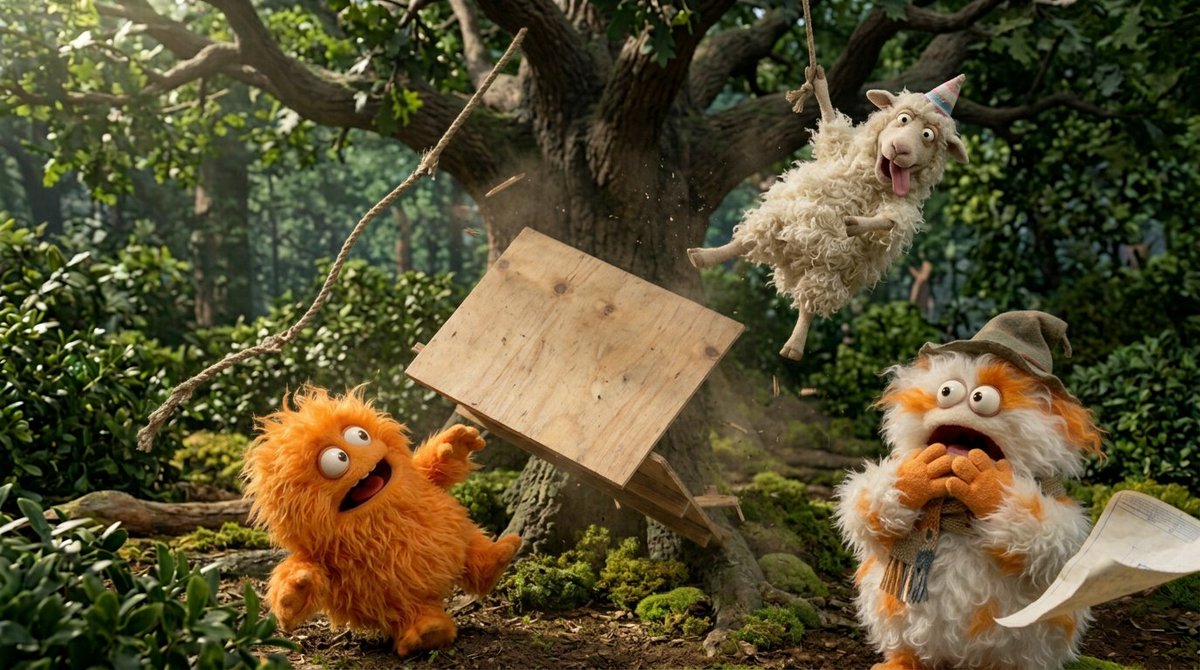
To kick off your creativity, here are some Nano Banana 2 prompts to try out. We hope you find them fruitful 🍌🍌 Prompt: Create a funny 4-part story featuring 3 fluffy creatures building a treehouse. The story has emotional highs and lows and ends in a happy moment. Maintain consistent identity across the 3 characters. Generate 4 images in 16:9 format, one at a time.


A few small updates today - we've added Moodboards and Personalization to Niji V7. We've released a much better web interface for Personalization. And we are sunsetting web rooms as we work on next-gen collab tools (which should make the whole site feel noticeably faster). Enjoy!
how to build successful software startups 2005–2025: great ui first, api as a bonus 2026+: great api first, ui as a bonus
With any social network: If you want to catalyze a new behavior, you have to overcorrect for a short period of time, especially for a long tenured userbase. (Please bear with Article Armageddon)
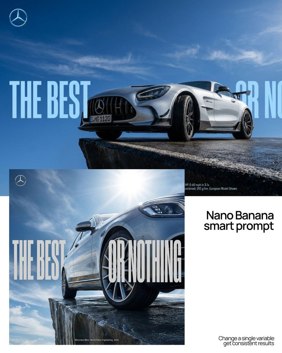
Nano Banana prompt: Social media ad template Swap one variable -> get: - brand-specific tagline, - key visual, - color system, - CTA button style. Prompt 👇
